Greetings!
I'm Lucy.
I'm a web designer and front-end web developer with a passion to solve problems in a strategically, pixel-perfect way.
I'm a web designer and front-end web developer with a passion to solve problems in a strategically, pixel-perfect way.


UI Designer and Developer
Graceland approached Speak Creative with a need for a new website that encapsulated the life and personality of the Elvis Presley estate and featured their new 200,000-square-feet exhibit complex, Elvis Presley's Memphis.
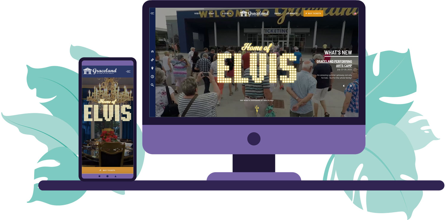
The site was designed to capture and showcase a little of Elvis' style and personality. Little touches were added such as the animated glitter buttons on hover. A drawer was added to the left side of the site for quick access to several pieces of content that were necessary for visitors to the site. Expandable menu items were also added to ensure that the menu wasn't too long but still gave users access that they needed.

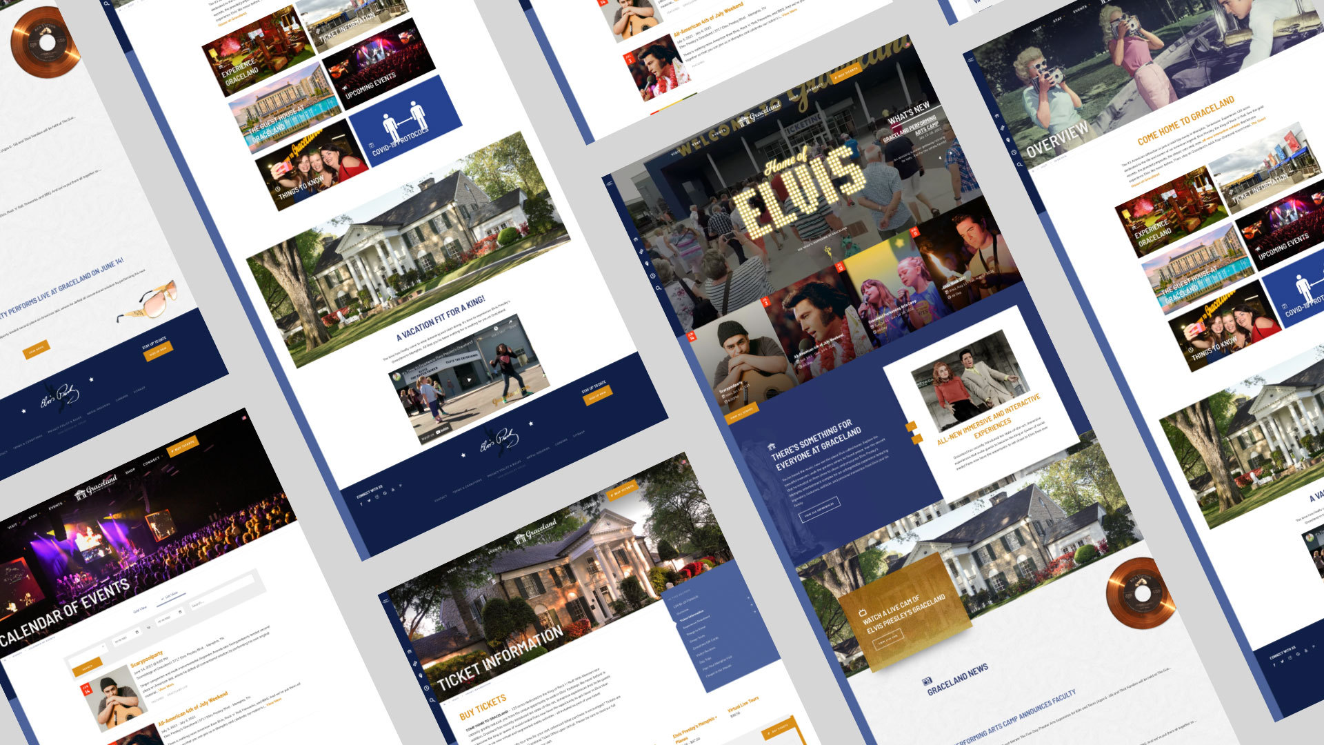
The site was developed with Speak Creative's proprietary content management system using jQuery to add more functionality and style.
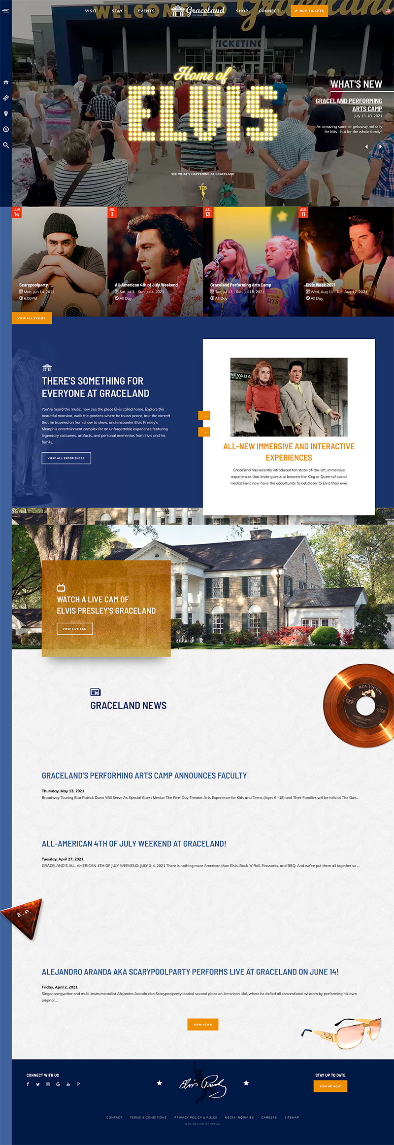

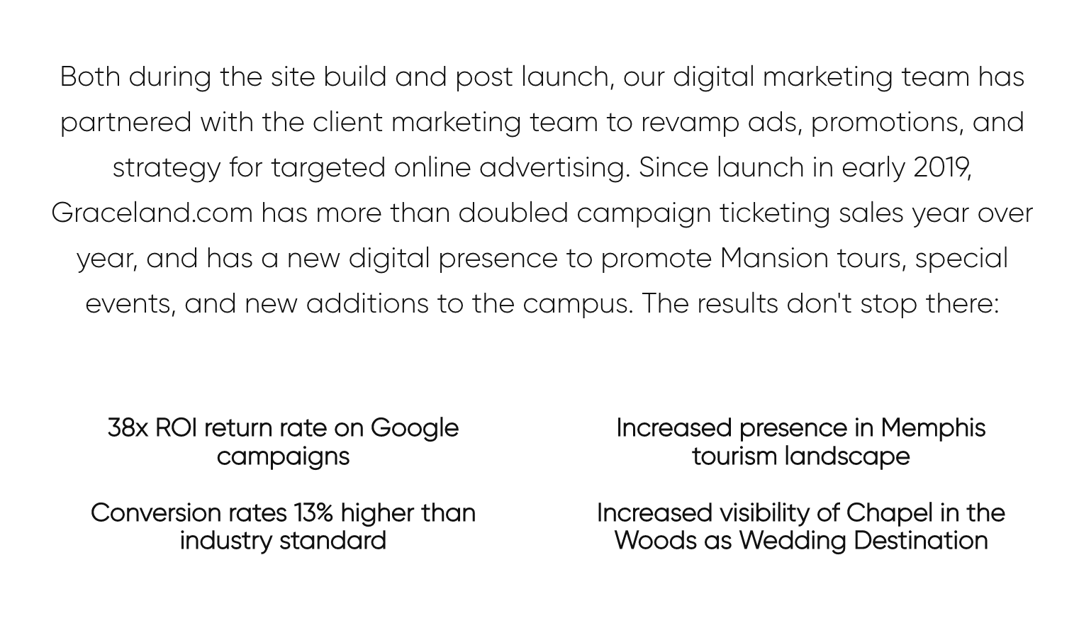
The biggest result is that Graceland.com has more than doubled campaign ticket sales year over year since its launch in early 2019.
UI Designer, WordPress Developer
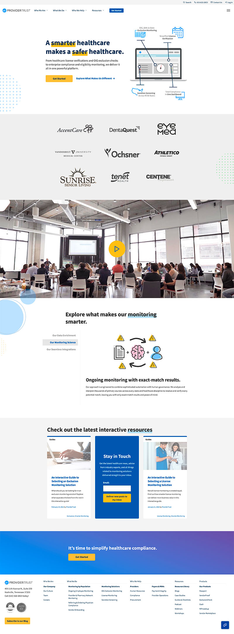
Provider Trust approached Speak Creative for an online solution that really allowed them to showcase their services and resources in a functional and elegant way.
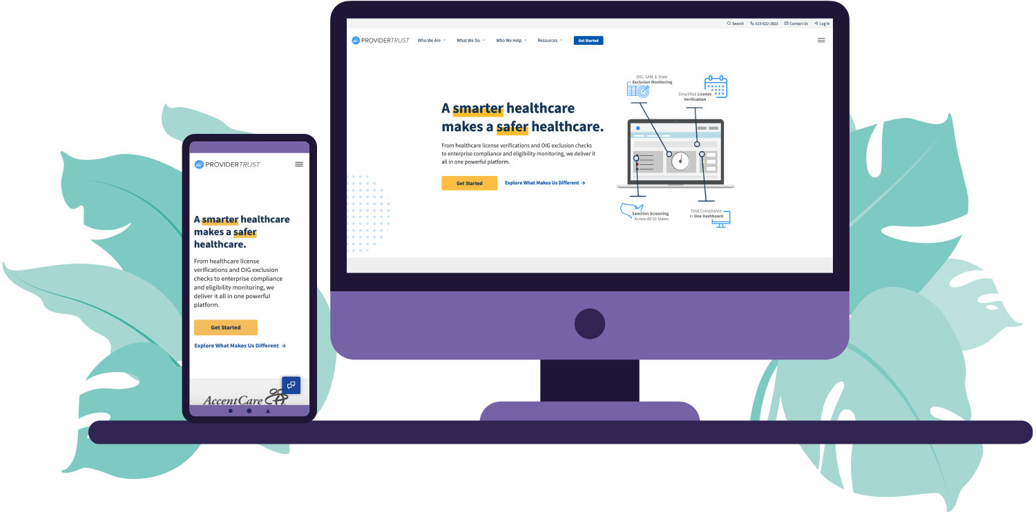
A complete design system was created for them to be able to showcase large amounts of data with a small footprint. The site includes animated SVGs, multiple tabbed sections, custom content and image sliders, animated timeline, interactive map, large resource library.
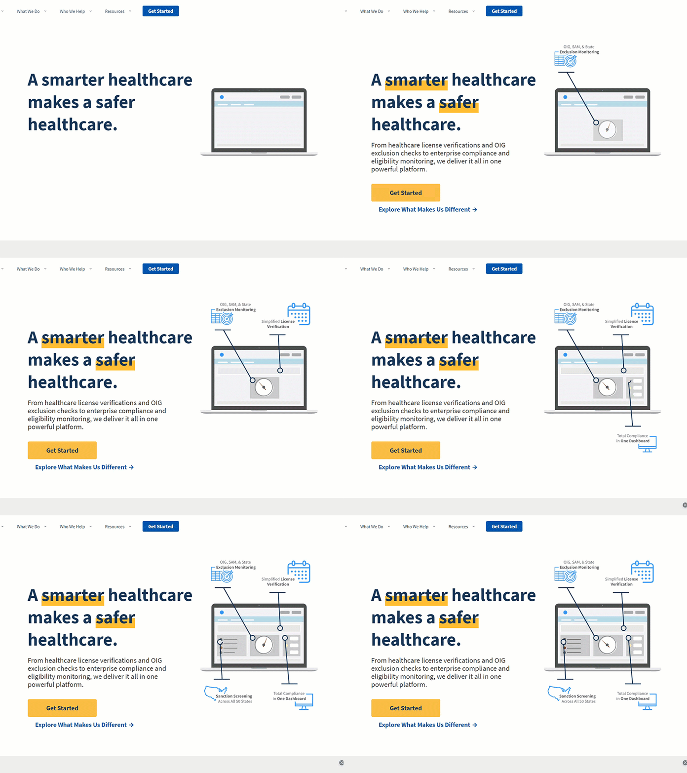
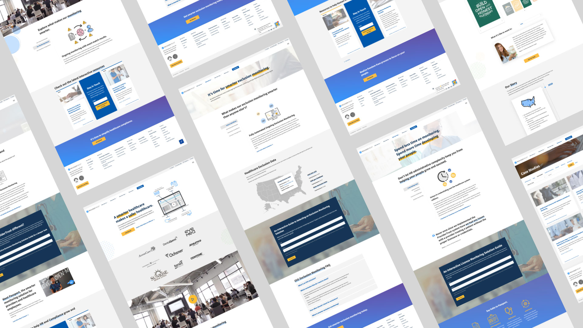
The site was developed in WordPress with custom post types to enable the user to add new blocks to new pages and edit them in an easy way. This meant a lot of careful planning on the backend to ensure that it couldn't be broken on the frontend by a normal user.

UI Designer and Developer
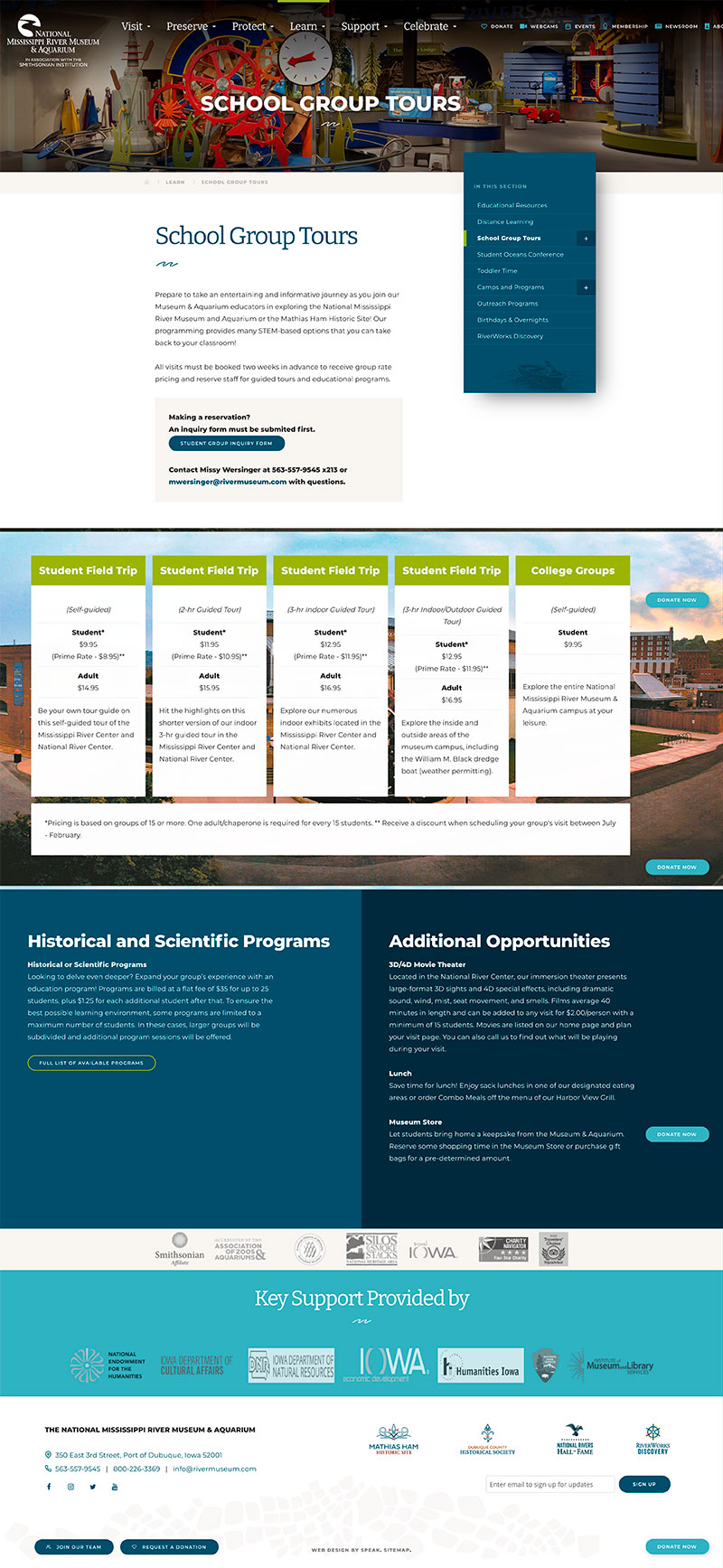
National Mississippi River Museum approached Speak Creative for a website that converted visitors into paying guests.
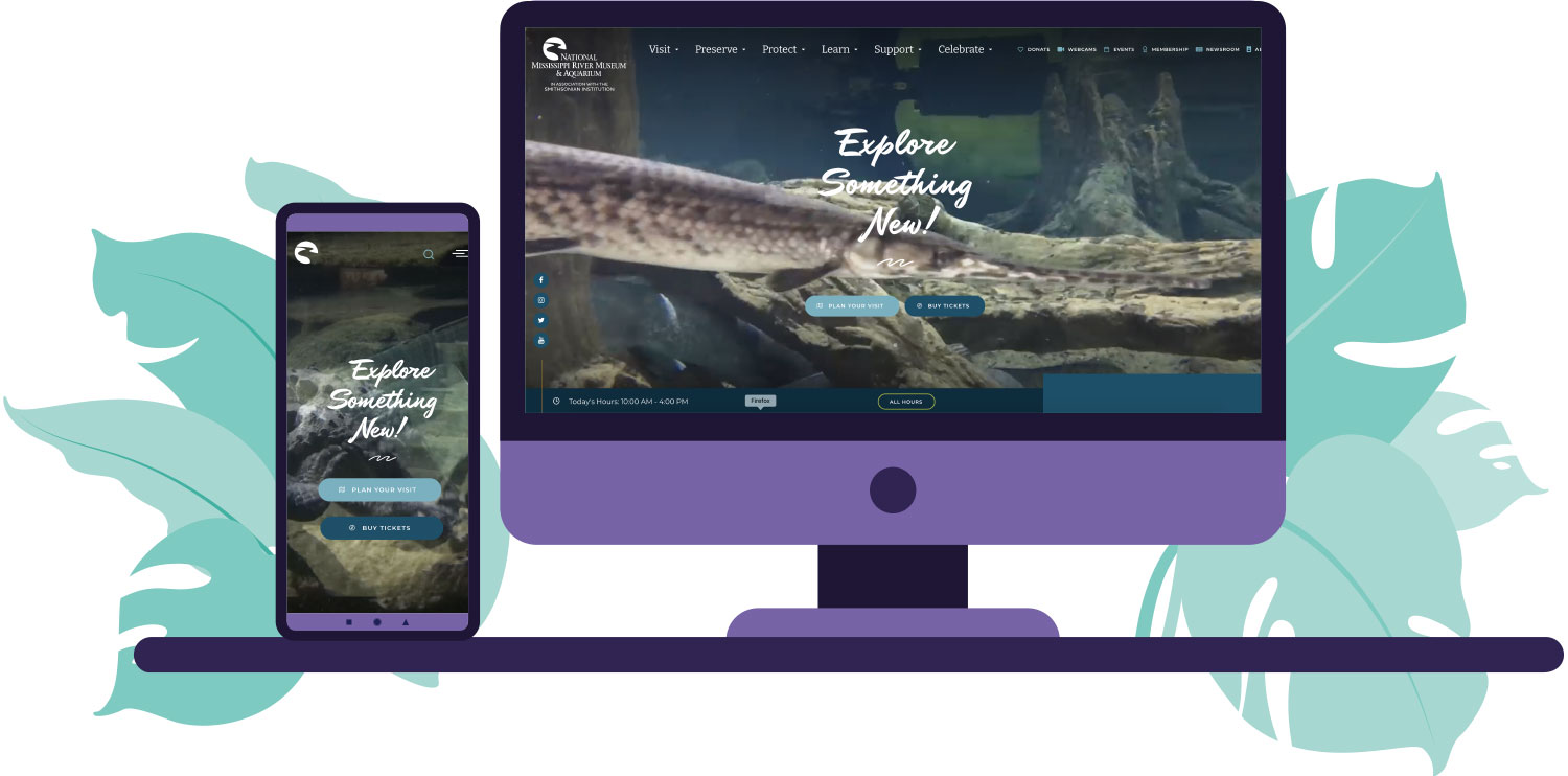
A unique design was created for them that showed how fun and interesting the museum was before the user visited. It included a river animation background on the homepage as well as several video sliders to organize their content.
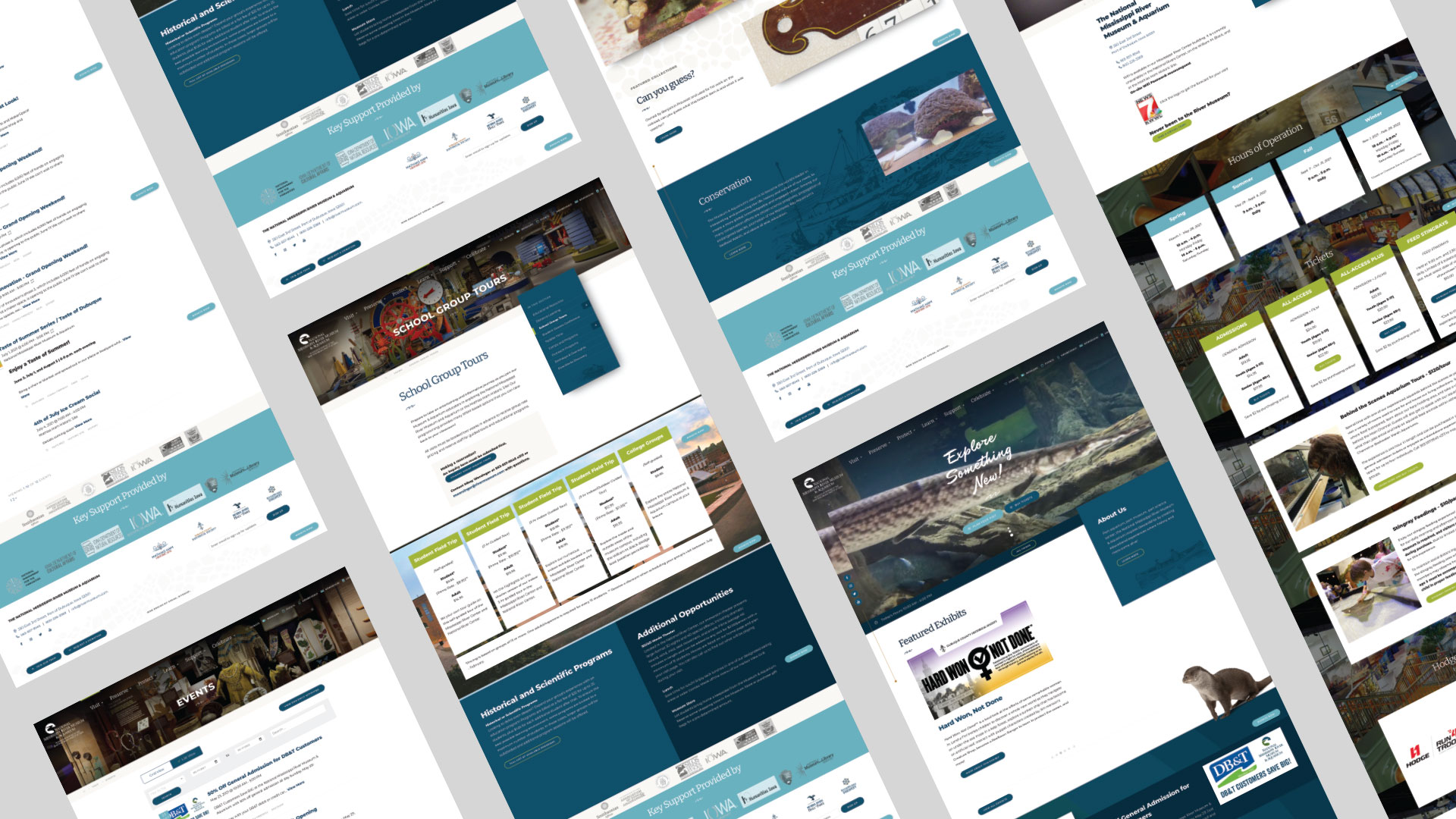
The site was developed with Speak Creative's proprietary content management system that included lots of jQuery and custom content types that allowed the user to edit and manage their site easily while preserving the integrity of the code.

UI Designer and Developer
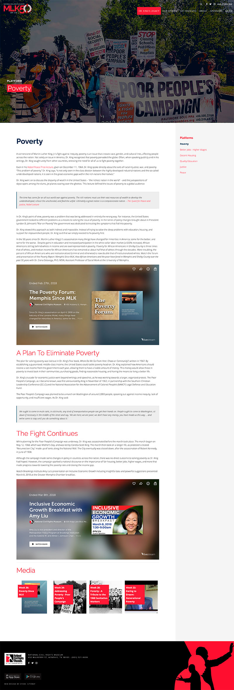
The National Civil Rights Museum approached Speak Creative for a website that would commemorate events leading up to the 50th anniversary of the death of Dr. Martin Luther King Jr. The site would highlight events held for the year as well as stories of how people were impacted by Dr. Martin Luther King Jr.
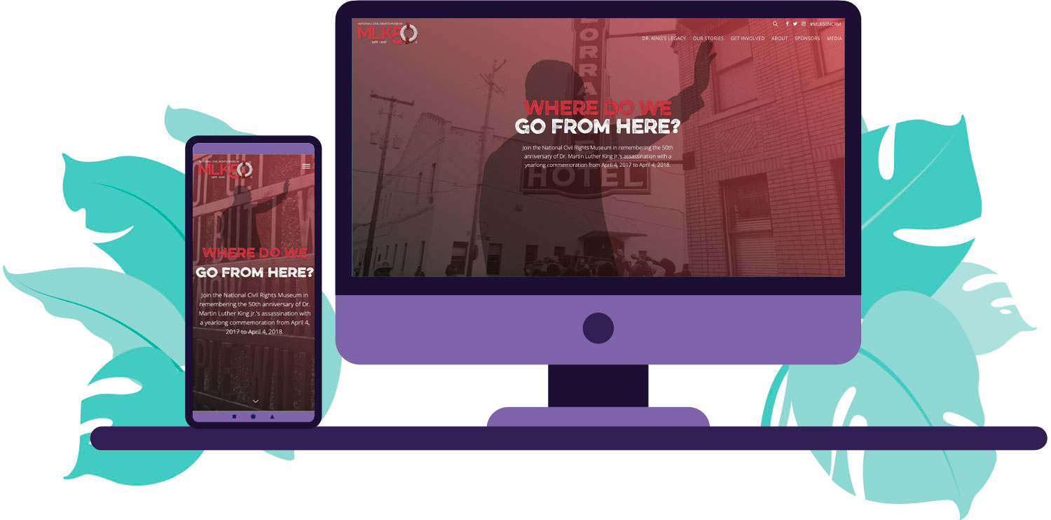
The concept for this site focused on presenting the information in a respectful yet provoking way. His recognizable silhouette was used in the hero and footer of every page. Since video was going to be a major content feature, the site was designed to present collections of video in an easy to use way.

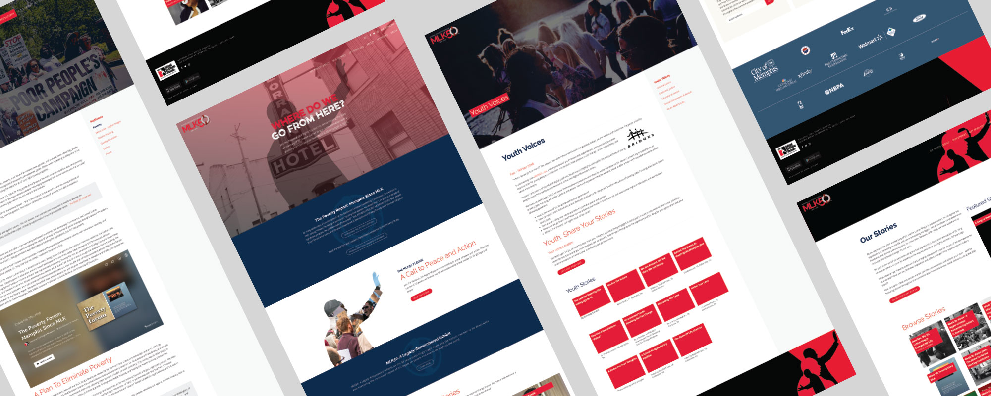
The site was developed with Speak Creative's proprietary content management system that included lots of jQuery and custom content types that allowed the user to edit and manage their site easily while preserving the integrity of the code. Animated SVGs and Bootstrap modals were also used throughout the site.

UI Designer and Developer
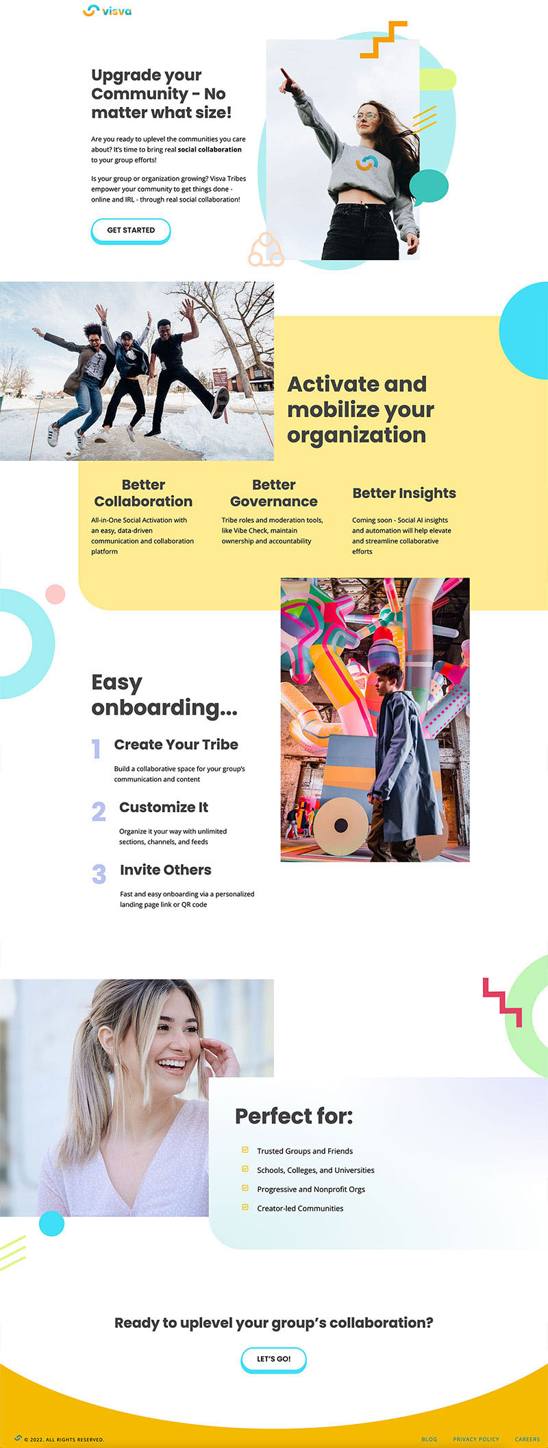
Visva wanted a site that represented their personality, related to their target audience, and provided information on current and upcoming features for their app.
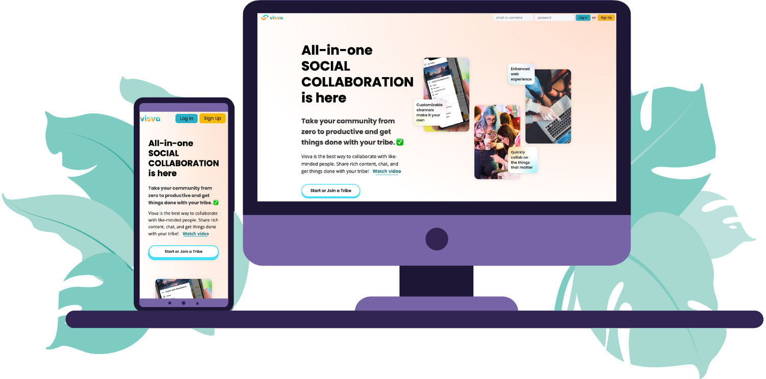
The concept for this site was inspired by their existing stickers and illustrations. In order to capture the company's culture and personality, colorful gradients and bold fonts were utilized throughout the design. Testimonial videos were added to increase user engagement.
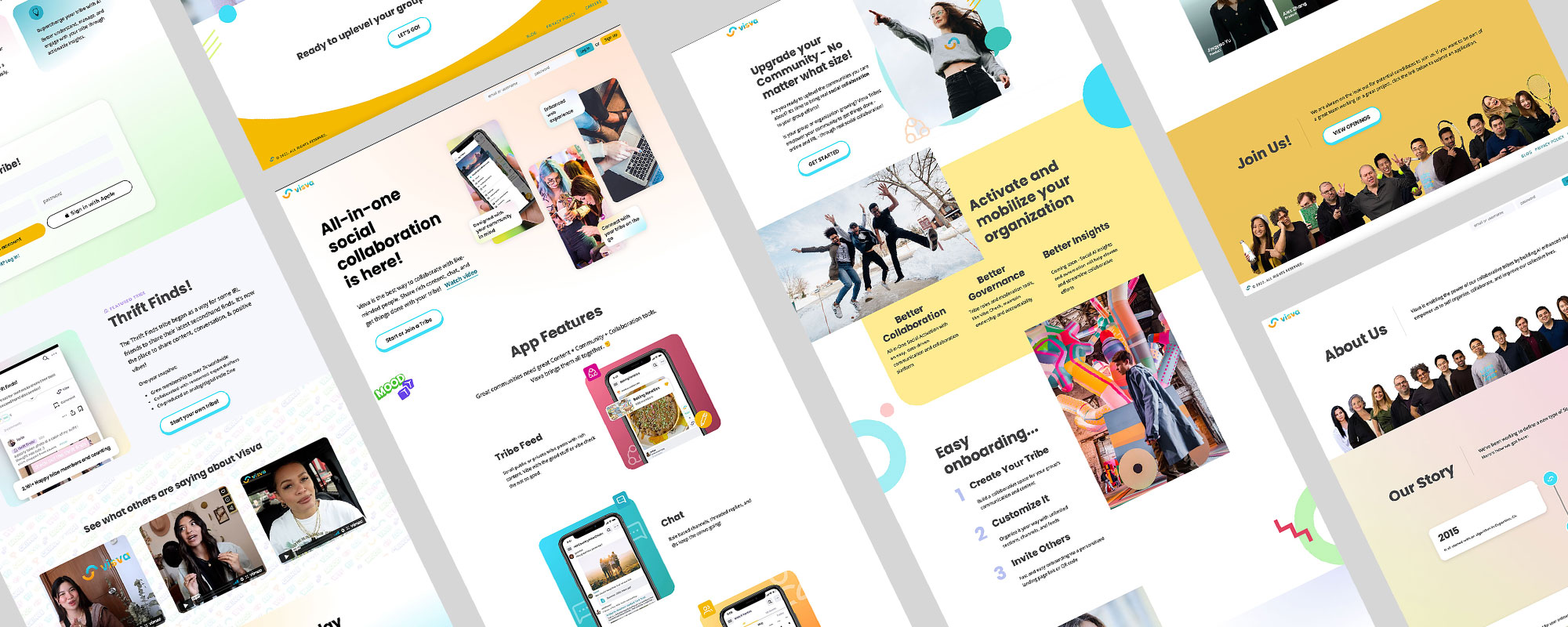
The site was developed within the existing Next.js codebase. Interactive flip cards were added to engage the user as they explored the cool features of the app. Scroll into view animation was added for interest along with some fun text masking animation. Check out the live site below!

Lead Product Designer
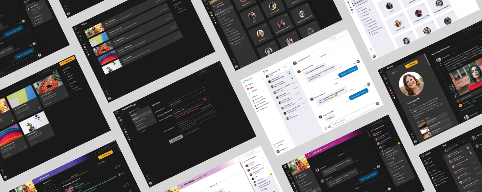
As part of their plans to evolve their current social media app, Visva explored the opportunity for an Electron-based desktop app that expanded their feature offering.
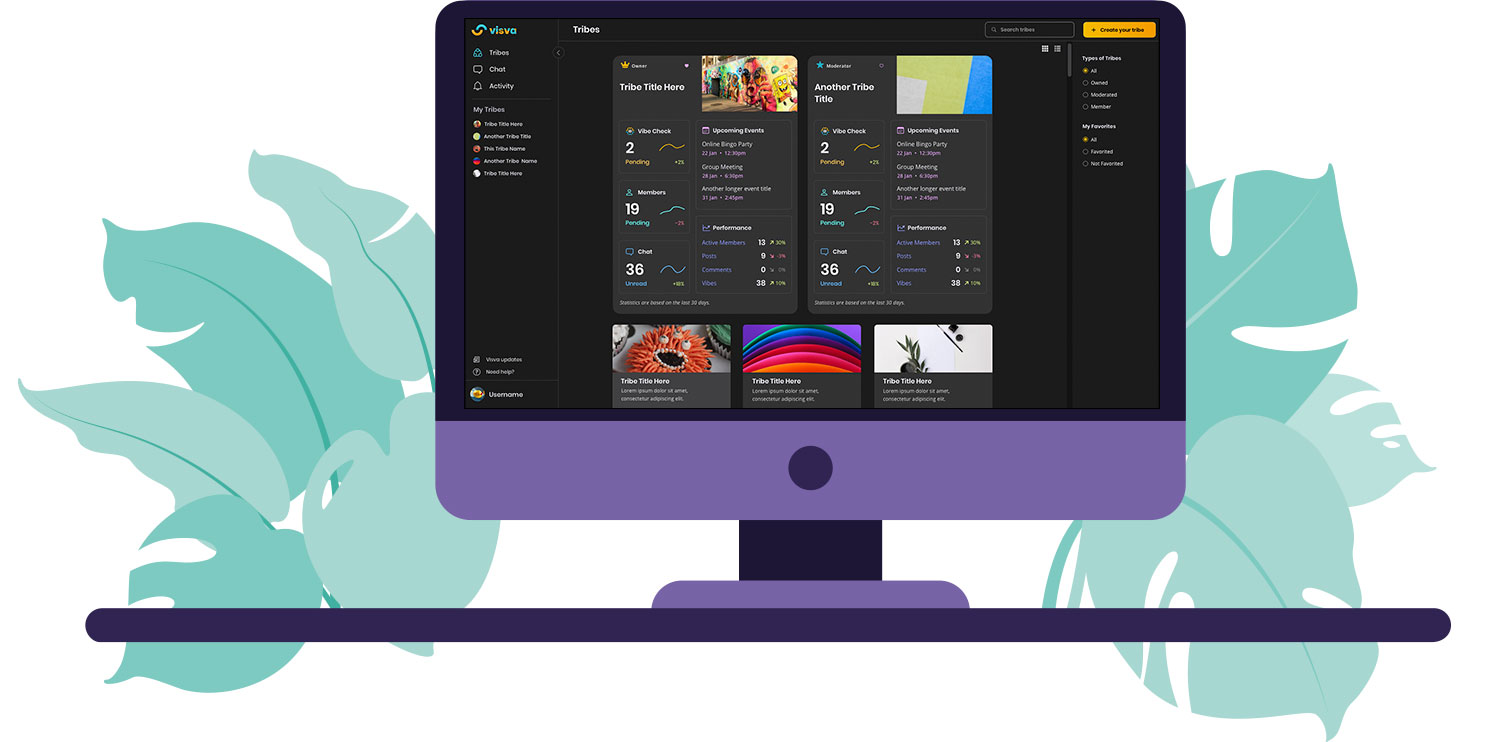
The concept for the desktop app was focused on making often complicated tasks easier and manageable. The target user for the app was a Group's Admin or Moderator and how we can make their job easier. They often had the job of managing members, tasks, events, documents and overall communication with multiple members. This app was designed to bring all that together in an easy-to-use and understand solution. Dark mode and light mode versions were created to support the user's system settings while encompassing the brand's fun color palettes.


UI Designer and Developer
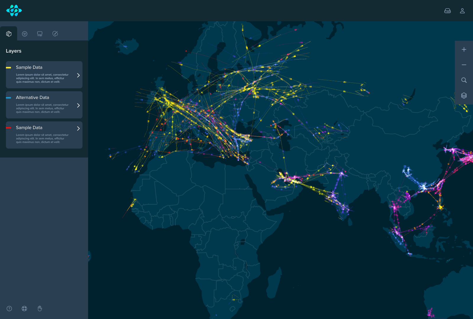
Element 84 wanted to create a way to showcase the powerful cloud-native, geospatial processing solution, FilmDrop.
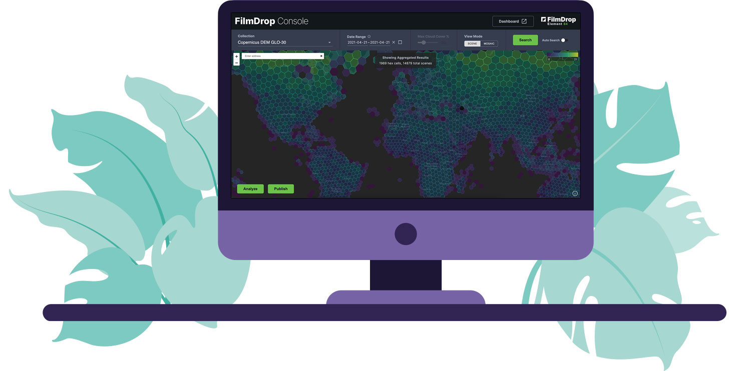
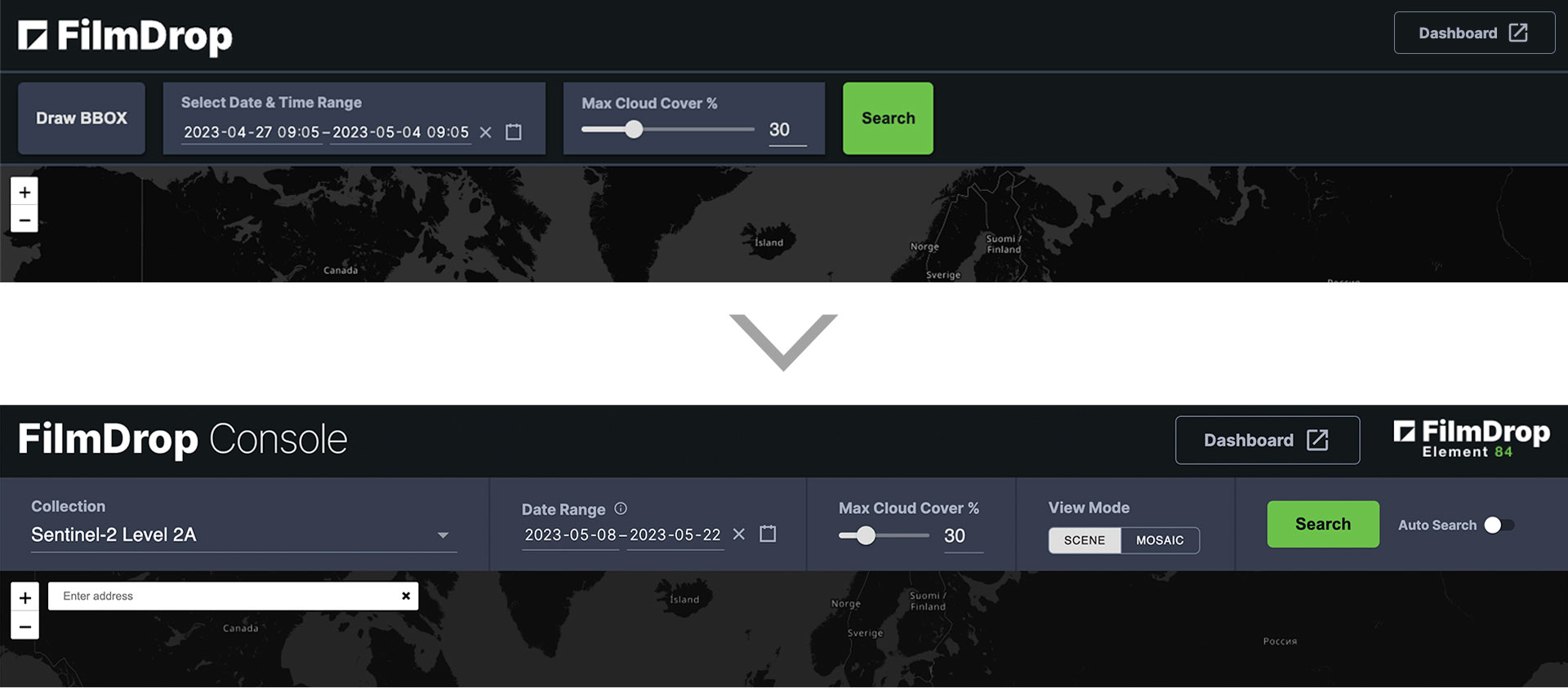
The concept for the app was focused on making the search process as easy and user-friendly as possible with minimal options. Adjustments were made to the UI as additional features were added. The background of the search bar was simplified and the elements were reordered for better usability.
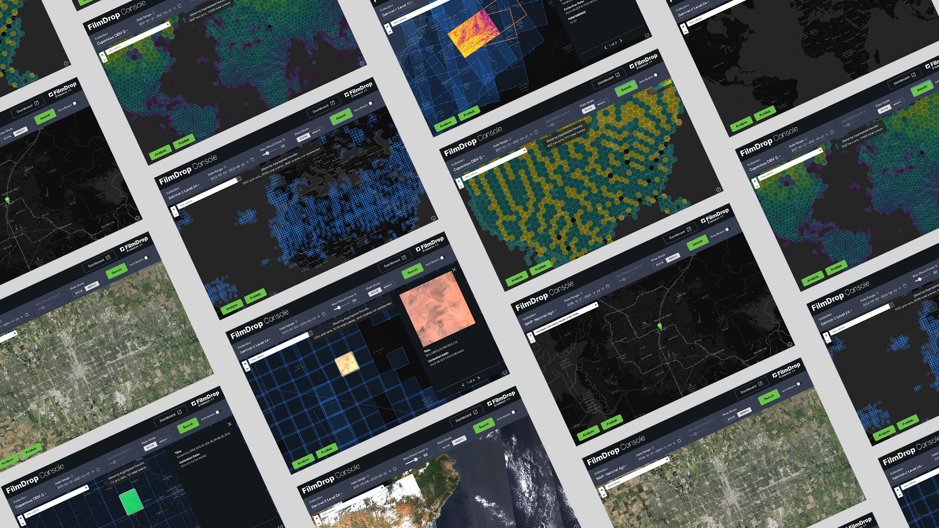
The existing app was built with React and Leaflet map. The app displays data available from the Earth Search Open STAC API. New major features were added and the entire project was moved to an open source repo on Github.
New features that I developed include:


UI Designer and Developer
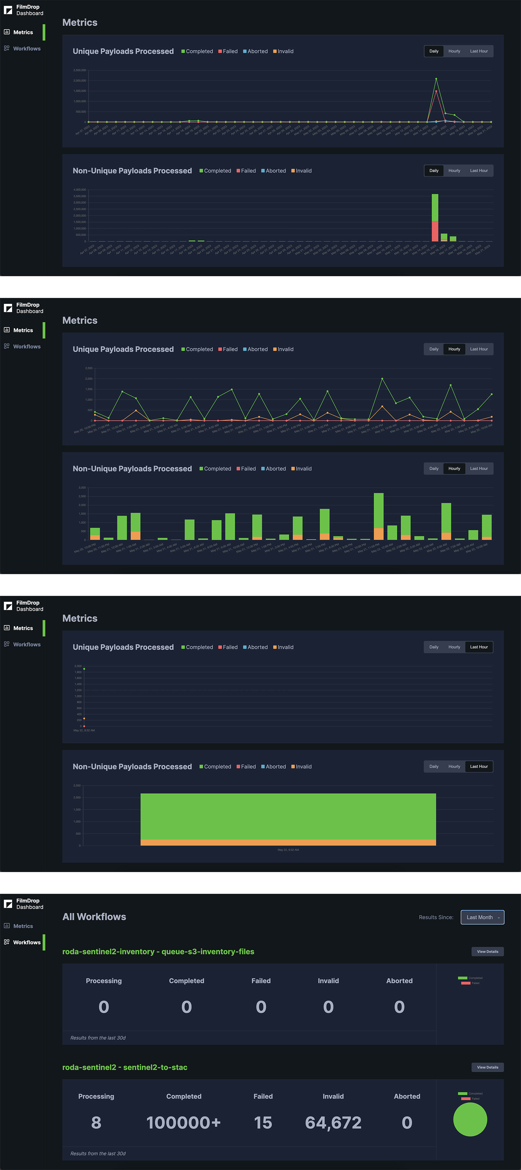
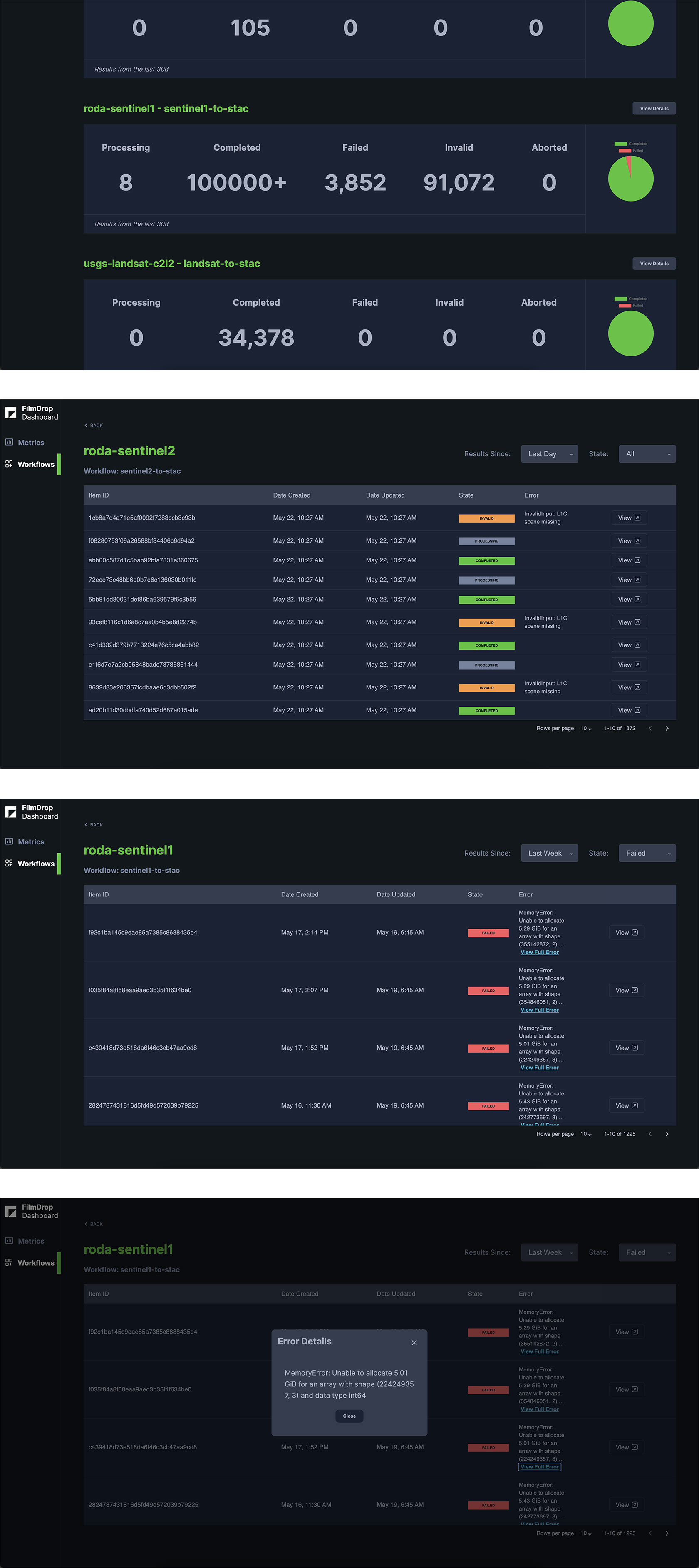
Element 84 wanted to add more features to their FilmDrop dashboard that displays metrics and workflows found in the Cirrus processing pipeline.
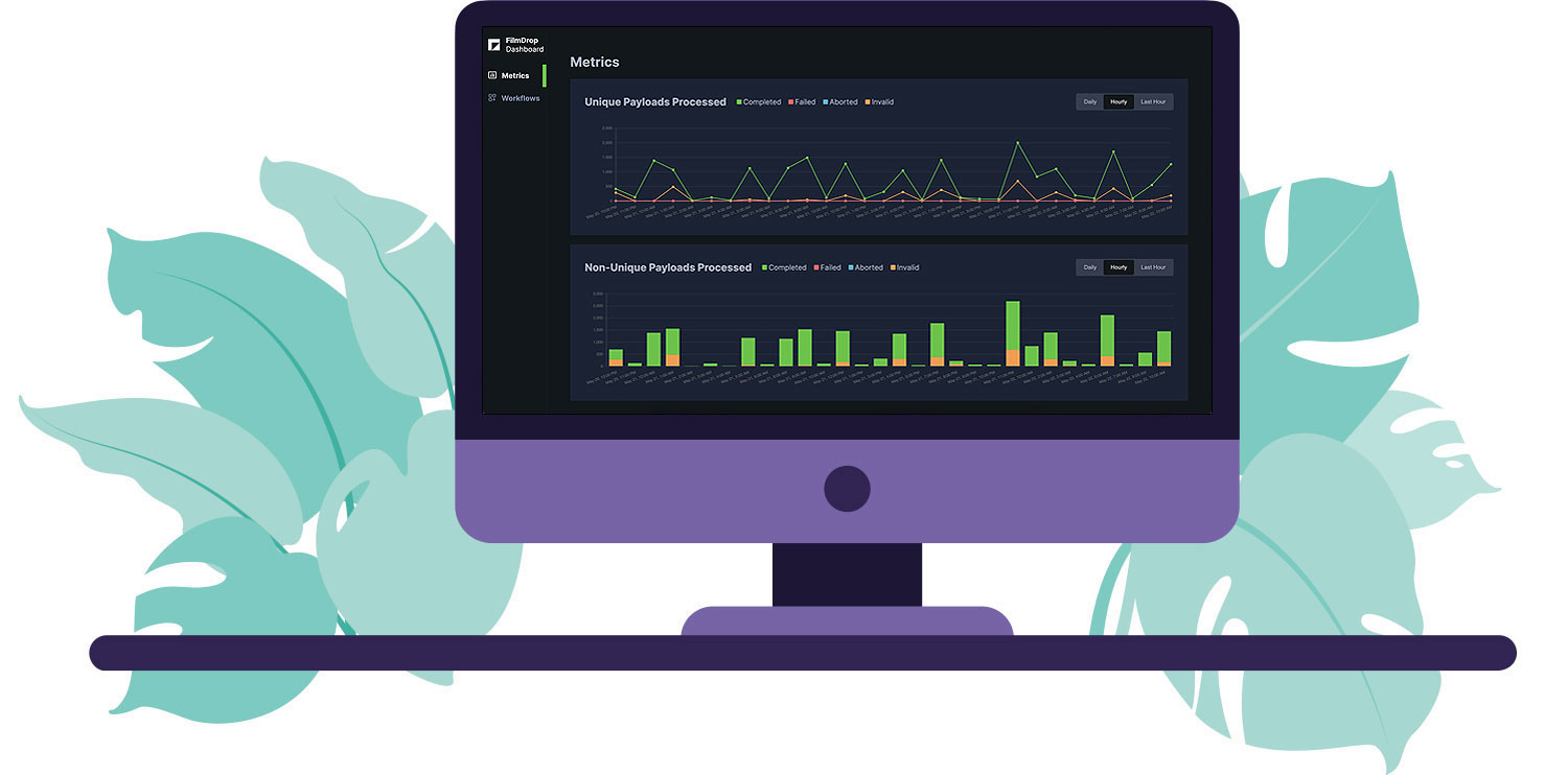
The additional features focused on displaying a line graph and bar graph for processed payloads in the pipeline. Colors chosen are part of the existing Element 84 brand.
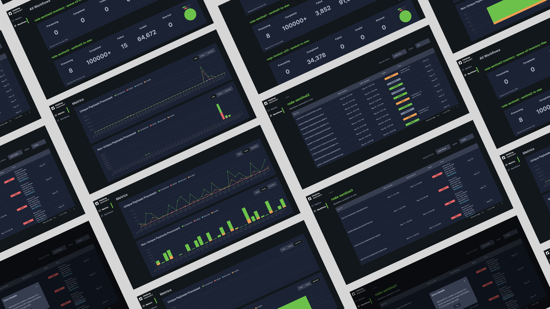
The existing app was built with React and Gatsby and initially displayed just the workflows found in the Cirrus processing pipeline.
New features that I developed include:
